Studio Practice
Painting: Methods and Materials
I came onto the MA in Painting course at Wimbledon without any degree level training in art. This is not to say that I had not spent years training myself. I had done the following courses in previous years.
Juliet Aristides, Edinburgh, Painting the Classical Figure 2017
Tim Hall, Cornwall. Portrait Painting 2016
Harriet Hedden, Short Course, Chelsea School of Art and Design 2015
Chris Gollon, Surrey 2014
Life Drawing Haselmere 2008
Andrew Brownfoot 2008
Rachel Clark Life Drawing 2007
Short course From the Inside Out West Dean College, 2006
Short Course Drawing Workshop West Dean, 2005
Elda Abramson, East bourne Zen Art 2001
Richmond Adult Learning Centre 2000
Vasundhara TIwari under Rjesh Sharma, New Delhi 1998
Betty Edwards Drawing on the right side of the brain. 1995
Rameshwar Broota Triveni Kala Sangam New Delhi. Summer school, 1994.
However, in the context of my classmates, I felt at a loss with regard to methods and materials. At the end of two years of study, having been encouraged and supported by my tutors to experiment and to explore, I have learned a formidable amount.
I will take you through my development in chronological sequence.
Bitumen, Gold Leaf, Clay on Board
At first I was fascinated by Gabriel Chaim’s use of bitumen and gold leaf. On board. I asked him to teach me his method. I then began experimenting on board with clay and bitumen and gold leaf. This is quite a long and laborious technique whereby one spreads bitumen on board prepared with gesso, waits3-5 days for it to partially dry and then introduce gold leaf and clay on to the surface. The contrast of the delicate gold leaf and the rugged bitumen makes an interesting contrast. The water based clay shrinks away from the oil-based bitumen to form an unpredictable painting. I felt that I had picked up a lot of information about putting materials that are polar opposites on the scales of density and light together.

I had never done any carpentry every before so this creation of my own boards was a steep learning curve for me.
Here are some of the paintings that I produced during Unit 1 and 2 all on board using bitumen, clay and gold leaf.


For Unit 1, therefore I produced a painting that used these techniques. Here it is below:

Uprooted 60 x 80 cm on Board. Bitumen, Gold Leaf, Oils, White, Tracing Paper
In using the Trace Down white carbon paper, on the above painting, I discovered that I really wanted to be precise in what I produced. I was encouraged to drop the use of bitumen and gold leaf, and I progressed to using black, silver and gold metallic paint. I also moved from the use of board to paper. See below.


For the Interrim show of 2018 I used a combination of metallic paint and acrylic paint.

Uprooted 5: 12 x 12 in. Metallic Paint and Acrylic
Because of my interest in definition and precision, I graduated to using felt pens. I produced quite a number of drawings. Using black felt pen upon white sketchbook paper. One sample is below.

The Evolution of the 6 am paintings
Thus felt pens, sketchbook paper and white space became my tools. The discovery of the effectiveness of these untraditional art mediums and methods to evoke a response from the viewer, was ultimately the reason that one of my main contributions to the Grad show of 2019 is my 6 am paintings, which are all done with felt pen on sketchbook paper, using a limited palette. The philosophy undergirding the use of these materials and this method is based on the Japanese principle of wabi sabi. In Zen Buddhism the principles of impermanence, imperfection and incompleteness are central and the process of art making is to coax beauty out of things that are conventionally held to be ‘ugly’.
Here is one example:

At the beginning of the course I argued with Geraint that part time students such as I needed studio space. How else were we to produce paintings of any significance? He was adamant that we would not get any studio space, but he pointed me in the direction of several artists who have produced large works while using small supports. For example Adam Pendleton. Jake and Dinos Chapman and Amy Sillman. Running with this idea of producing a wall of large work comprising of many small works, I have thus produced over 70 6 am paintings. I began these paintings in October 2018 And they have now become part of my early morning art practice. I will only briefly describe here my process of coming up with each of the images. This has been fully documented in my essay. Every morning at 6 am I make myself a mug of tea using the Japanese tea ceremony adapted for life in modern Britain as a template. This requires me to enter into the Now, a meditative state called Mindfulness. In this state, I take out my sketchbook and felt pens and face my blank ‘canvas’ with beginner’s mind. Waiting for an image to emerge. I then begin ‘painting’. I paint each morning for between 1-3 hours depending upon whether I am seeing clients at 8 am or 9 am. Being at the end of the age spectrum, I have a way of supporting myself financially that gives me both artistic freedom and much needed time for creative experiments.
Below is a composite photograph of 74 6 am paintings exhibited in the Final MA Grad show. In total there are close to 100 6 am paintings as I write. Each of these 6 am paintings can be individually examined in the section called Artwork. I painted the wall ‘Poppy Red” with the plan that it would only show through the holes of the torn out sketchbook paper. I left one space of red blank to signify incompleteness.

Composite 6 am Paintings 430 x 220 cm Sharpies and other Felt Pens
Collage
My Unit 1 assessment feedback encouraged me to investigate collage, bricolage and assemblage:
‘Practices of collage, bricolage and assemblage seem particularly relevant, and it would be good to do some more research into artists and writers who have explored these ways of making…’
In Unit 2 therefore I looked more closely at collage.
Since my doctoral work was originally on ethnic minority identity and the experience of disadvantage and my recent work was on resilience and flourishing, I combined these two strands into a painting called BAME sisters: The Gender Pay Gap. I also incorporated the use of text to elucidate the intention behind the painting.
In order to produce this painting I cut magazine images of successful ethnic minority women and collaged them together thus.


BAME Sisters: The Gender Pay Gap . 90 x 90 cm Oils
This painting seemed successful to me and I will continue to explore the use of collage and projection in paint after the course. However the use of readily available images from magazines and the internet seemed to me to be less ‘worthy’ of genuine artistic endeavour and thus I began to think of asking a model to pose for photographs that would then produce a series of paintings. I asked my friend Ruth to pose for me and together we produced over 130 photos, which then became the basis of my Burnout Series.


The use of white space on paper in my painting was encouraged by my visit to Oxford to the Colette Johnson exhibition (See below).

Collette Johnson Oxford Museum of Modern Art
It is also informed by the Wabi Sabi principle of incompleteness (the other two are impermanence and imperfection which are also embodied in the materials I have chosen to use). Also the Japanese art form of Ikebana is hinged upon the relationship of space to object and this fits well with what I produced. Here is one example of the use of space in Japanese flower arrangement using the technique and philosophy of ikebana.
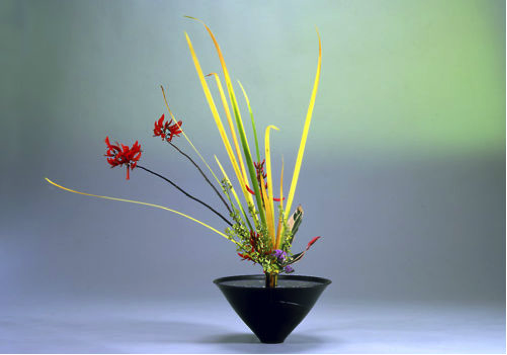
Ikebana Flower Arrangement Showing the Importance of the Use of Space between Objects as Part of the Total Whole.
While I was in Japan, I came across the work of Lee Ufan, who is a South Korean artist living in Japan. Ufan is one of the main proponents of the Mono-ha school of art, which in the words of the Pace Gallery is among Japan’s first internationally renowned art movements. Lee Ufans‘s practice is characterized by
‘thoughtful and direct iterations of gestures and thematic contemplations of encounter that manifest in installation, sculpture, ceramics, paintings, and works on paper. ‘ (pace Gallery)
In 2010, the Lee Ufan Museum, dedicated to the artist’s oeuvre, opened on the Japanese island of Naoshima. I visited in 2019.
What remained in my mind was a series of paintings in which Ufan loads his brush and carries it in a straight line down the canvas without re-loading it.

Lee Ufan From Line
According to Lee Ufan, “The work is never complete, because there is no perfection or completeness.”
I used this technique in the Burnout Series and in Friday Evening on the skirt and the hair of the woman in the painting . Here is a detail form each of the larger paintings.


Detail of Friday Evening 1 and Friday Evening 2: Monoha Brush Strokes
I achieved this effect with a bamboo pen originally designed for Arabic calligraphy. See below.

Burnout was called a ‘winning’ painting by Sarah Kate Wilson at our Interim show at the Nunnery, which was hugely encouraging to me as I had many doubts about it, as it is so different to what my classmates were producing. In a group Crit with the MA Drawing students, Lucy George mentioned she thought that the Burnout series represented a ‘complete drawing and an incomplete painting’. As my purpose was to create an incomplete painting (re Wabi Sabi) I was happy with this comment. I also thought that since it was a complete drawing I might just give it a shot at the Trinity Buoy Wharf Drawing Prize Competition (formerly the Jerwood Drawing Prize competition). After all what was there to lose? The first painting of the triptych has been accepted to be exhibited in the Trinity Buoy ‘Wharf Drawing Prize exhibition of 2019. Sadly I did not present the second and the third for evaluation and they were thus not selected.
I initially used Bockingford 320g/m2. I had been on a course with artist Elda Abrahamson in Eastbourne which was titled Zen and the Art of Drawing. She introduced the students to Brusho drawing inks and I bought a set. These inks are made from pigment which are then mixed with water to form translucent, watery vibrant colours. Elda had also introduced us to the use of bamboo pens to produce black outlines with Quink Ink.

Brusho Inks and Bamboo Pen
After Burnout I produced 4 more paintings using the principles outlined above. Here is a triptych called ‘Thank you Jesus, Bye’ detailing illness, death and impermanence. This series aroused mixed responses from the tutors and students. In our group crit, this series was considered ‘too earnest’, ‘clumsily painted’ and ‘the weaker part of my work’. See below People raised questions about the hair which was just white space enclosed with a simple line and the hands, which they said did not look as if they belonged to an old woman who had just died. I was encouraged to look again and think again and perhaps just paint the hands. I have not done this yet. However, these comments pointed me in the direction of a more limited use of my bamboo pens.
Others were fascinated by the paintings, my family specially loved them and one tutor and pointed me in the direction of graphic novels in particular the work of Anna Bechdel who painted a lot of autobiographical material. This tutor suggested that I paint more and more of these images detailing the various stages from illness to death and beyond. With these polar opposite responses, I felt a little befuddled. I have left this series aside for now and will think about what to do next.


Thank you, Jesus, Bye: Triptych. 40 x 59.4 cm Inks and Bamboo Pen
With so many different responses to the above paintings and with the words ‘clumsily painted’ ringing in my ears, (for which now I am very thankful) I began to explore a new product on the market i.e Posca Acrylic markers. These are markers filled with acrylic paint. In order to use them one needs patience and skill due to the fact that one needs to draw the paint down periodically, just as one would load a brush. I initially made many blobs of paint on my first attempts but gradually I learned to control the flow of paint so that it came out in a fine line.


I returned to the Burnout series which had won acclaim both at the Interim show in June 2019 at the Nunnery where it was called a series of ‘winning paintings’ and at the Trinity Buoy Wharf Drawing Prize competition where Burnout 1 was selected for inclusion in the 2019 Exhibition. For our Final show I wanted to produce a painting of substantial size. I first tried canvas and Posca acrylic markers and oil paint.

Friday Evening 1: 100 x 120 cm Mixed Media
I was not happy with the outcome (above) because I had painted the canvas cream and the hallmark of Burnout was the white, empty ppace of the canvas, emptiness being a fundamental concept undergirding the Buddhist mind-set. My graphic designer daughter, Tanya did not rate the success of this painting either and said to me, ‘Mum go and get some large paper and go back to your inks’. She pointed me in the direction of Atlantis where I explored many varieties of large paper and finally bought Snowdon 320 gsm 140 cm x 100 cm. Because it was a smooth cartridge paper, it presented me with difficulties I had not encountered before when I used Bockingford. While it was good for the acrylic marker that I intended to use, it produced vey patchy blobs when I used the Quink. However when I used the Brusho drawing inks, the effect was smooth and translucent. I therefore forsook the use of Quink Ink for this paining for much of this painting except for the skirt of the woman. But this was a loss. In future I will look for giant paper with more texture to its surface.
But how to paint with inks on giant paper? It needed to be flat and accessible in terms of height. I ordered a large piece of MDF and used this as a base for the creation of this painting.
Here is the final painting that ‘emerged’.

Friday Evening 2 100 x 133.5 cm . Acrylics and Inks.
I was happy with Friday Evening 2 because of its finesse but the question that was foremost in my mind was ‘How to present a very large sheet of paper?’ At first I played with the idea of just tacking it to the wall. I bought self-adhesive magnets for this purpose. They did not work, as the adhesive was not strong enough to hold the paper in place. Also I was not at all sure about the placement of a white sheet of paper on a white wall, which was a different shade of white. I then toyed with the idea of placing the paper on a sheet of OSB, which is a cheap building material. I had used three sheets of this to produce plinths for seating and for a counter (more on this later). My architect daughter suggested that I place the MDF that I had used to provide a firm surface upon which to draw and paint, on to of the sheet of OSB, thereby creating what is termed a ‘shadow gap’. With invaluable DIY help from my classmate Rick Roberts, this is what I chose to do having first painted the edges of the MDF red with the paint that I had used on the wall to present my 6 am paintings.