Street Address
City, State, Zip
07741318621
Your Custom Text Here

Unit 1 Critical Reflections
Critical Reflections:
Tutorials, Lectures and Group Crits
In this section I reflect upon what I have learned in the tutorials, lectures and group critiques (crits) that I have had with my lecturers and fellow students. In addition, I have taken one piece of art that was discussed on BBC radio and one recently published book to look at.
I use the Kolb learning cycle (See Supporting Information) to enhance my progress in art. Kolb’s cycle has 4 stages: 1) concrete experience (e.g. the group's comments on a painting I have done) 2) reflective observation (i.e. self-reflexivity on the comments offered) 3) abstract conceptualisation (thinking about principles that can be abstracted from the comments and 4) active experimentation (trying out new ideas in new art pieces). This is a well known and well tested way of getting the most benefit out of learning experiences.
“When I look at my late return to art, I’d say the most useful thing I did was to accept that most of the time I would be out of my comfort zone… but once you make a choice to take you are seriously and push yourself forward, there’s no stopping.”
I started painting at the age of 5, then took a gap of 11 years and started again at the age of 16, then took another gap from 19 to the age of 41 during which time I competed a doctorate from Oxford University, wrote my first book (Hutnik, 1991) and brought up two lovely daughters. I have painted seriously since then, albeit around the demands of motherhood and a career as a psychologist, but with gusto and passion. I have attended many lectures and workshops in India and in the UK, tutoring myself, partaking in exhibitions, selling pieces of art and then took the decision to formalise my passion for art in a new career move: an MA in painting at the UAL in Wimbledon. Needless to say I feel out of my comfort zone. But as Laura Boswell says I have made a serious choice and I am pushing myself forward. There is no upper age limit to being an artist and I reckon I may have aa good number of years ahead of me if I am lucky. Sheila Girling died at 90 , Picasso at 91 and Wikipedia lists 73 artists internationally practising over the age of 100, not including photographers, sculptors and ceramicists! (See Centenarian artists accessed April 27th 2018).
Tutorial 1 with Geraint Evans October 2017

Tenderly Together 1 Mixed Media: Spray paint, acrylic, felt pens, jute Size: 50 x 40 cm
My first intention when I entered Wimbledon was to learn how to portray positive emotion. Being originally trained as a psychologist, and having designed and launched a postgraduate diploma course in Cognitive Behaviour Therapy titled Resilience and Positive Development and published a book in this vein (Hutnik, 2017), I am interested in resilience and positive development . Positive psychology research (Cowan and Keltner, 2017; Seligman, 201) has outlined many new positive emotions (Anwar, 2017) which often do not get a voice in painting (however, see Rockwell) : emotions such as awe, admiration, aesthetic appreciation, excitement, tenderness, joy, gratitude. And so I juxtaposed the birth of my grand nephew with his mother and father set against the background stress of bustling, modern city life.
Geraint’s response to this painting was that it was the juxtaposition of the stress of living within the city and the tenderness expressed between the members of this young new family that made this painting an interesting one. Thus the danger in wanting to portray positive emotion without context is that it would look like happy clappy evangelicalism (my interpretation) or Russian avant-garde art (Osipova, 2017) that occurred at the time that Stalin was killing millions in Russia. I learned that paintings need to elucidate the tension between two opposites: darkness and light, heavy material and feather light substance. In the above, and with reference to Ecclesiastes 3: There is a time to be tender (over the new born) and a time to be tough (to work hard within city life so as to make the time to be tender). The artist most who influenced this work most was Elda Abrahamson whose vibrant work with inks and bamboo resonate with my Indian background. Work supporting this painting is found in Supporting Work.
The fact that I had framed the painting of the couple with the young baby with a black frame was brought into question as well, causing me to look more closely at the supports I was using to present my work.
Geraint questioned the use of felt pen and questioned the use of spray paint and suggested that I explore other materials too. However, I enjoy the use of felt pen because of the amount of control it gives me. It is a marginalised paint medium and with all due respect I will continue to use it, at least occasionally. See ‘Betrayed by Brexit’ below and ‘Uprooted 1,2,3,4’.
In September 2017 I painted the following, portraying a mother and her daughters. Responding to Geraint’s encouragement to explore different materials I tried the same at a pottery workshop in a short 4 hour time span on ceramics.

Mother and Her Daughters Medium: Acrylic Size: 40 x 40 cm

Mother and Her Daughters Medium: Ceramic
This was only partially successful due to my inexperience with how the colours work when they are fired in a kiln. I may try it again.
Group Crit with Kate Simpson November 2017
I presented two works:
Betrayed By Brexit:
This work was done on three A3 sheets of cheap sketchbook paper and felt pen, representing two marginalised media.

Betrayed by Brexit Medium: Felt tip Size: 120 x 42 cm
This work produced more comment than I was interested in. It was a portrayal of the heartbreak I felt as an ethnic minority individual living in Britain at the Brexit vote. I was unwanted and an outsider. The panel on the left represents faces that are coloured in the proportion of the 2011 census and held together by the colours of the Union Jack. The panel on the extreme right portrays an increasingly homogenous Britain. The main ideas that I took away from this tutorial were to continue using felt pen because it was a marginalised medium and to do more. Kate Simpson also questioned the use of the term Disunited Queendom which is written across a divided Britain lying on its side, asking whether I was blaming a woman for what was happening to Britain. I was encouraged to weave my doctoral work, which was on ethnic minority identity in Britain, into further work. To this end I attended a Seminar at Goldsmith’s titled, Encountering Difference and got in touch with other work on difference (Wainwright, 2017) However, I find myself only marginally interested in taking my art in this direction. (See Supporting Work)
The Ballad of David and Nimmi
The second work was titled The Ballad of David and Nimmi and was intended to portray the deep feelings of love and playful tenderness. While some members of the group and in particular Yulia Mahr really liked this work, it produced scathing comment from Kate Simpson: ‘So I see a cross cultural couple, So what? Do more. You won’t get there in 2 weeks.’ In a later tutorial however, Mark Fairnington labelled this painting ‘naïve expressionism’ and said that he could not fault the drawing. I owe a lot to Chris Gollon for this particular style (See Supporting Work).

The Ballad of David and Nimmi Medium: Acrylic Size: 40 x 50 cm
Learning from my peers:
Gabriel Chaim’s technique with bitumen, gold leaf and clay
Meanwhile I was fascinated by what Gabriel Chaim was doing and requested that he teach me his technique, which I later experimented with.
One of the most important influences on my work is the art of Pascal Magis whose use of abstract forms informs this work.

Sunscape1 Medium:Bitumen, Gold Leaf, Clay. Size30 x 30 cm
Sunscape 2. Medium: Bitumen, Gold Leaf, Clay. Size: 20x35cm
Lecture by Simon Callery: on Materiality
Though Simon came across as anti psychology and pro anthropology in the discussion after his lecture on materiality, his tutorial with me was supportive. He made me aware of the works of Cy Twombly and encouraged me to use the MA to explore. I produced a number of different pieces exploring different media for the use of gold leaf and the production of positive emotion for example Indian Wedding alongside . See Supporting Work for more of the works I produced.
After this I returned to the exploration of bitumen, gold leaf and texture and experimented with the introduction of colour into this technique. I produced Memories of Kerala below.

Indian Wedding Medium: Acrylic and Gold Leaf Size: 26 x 18 cm
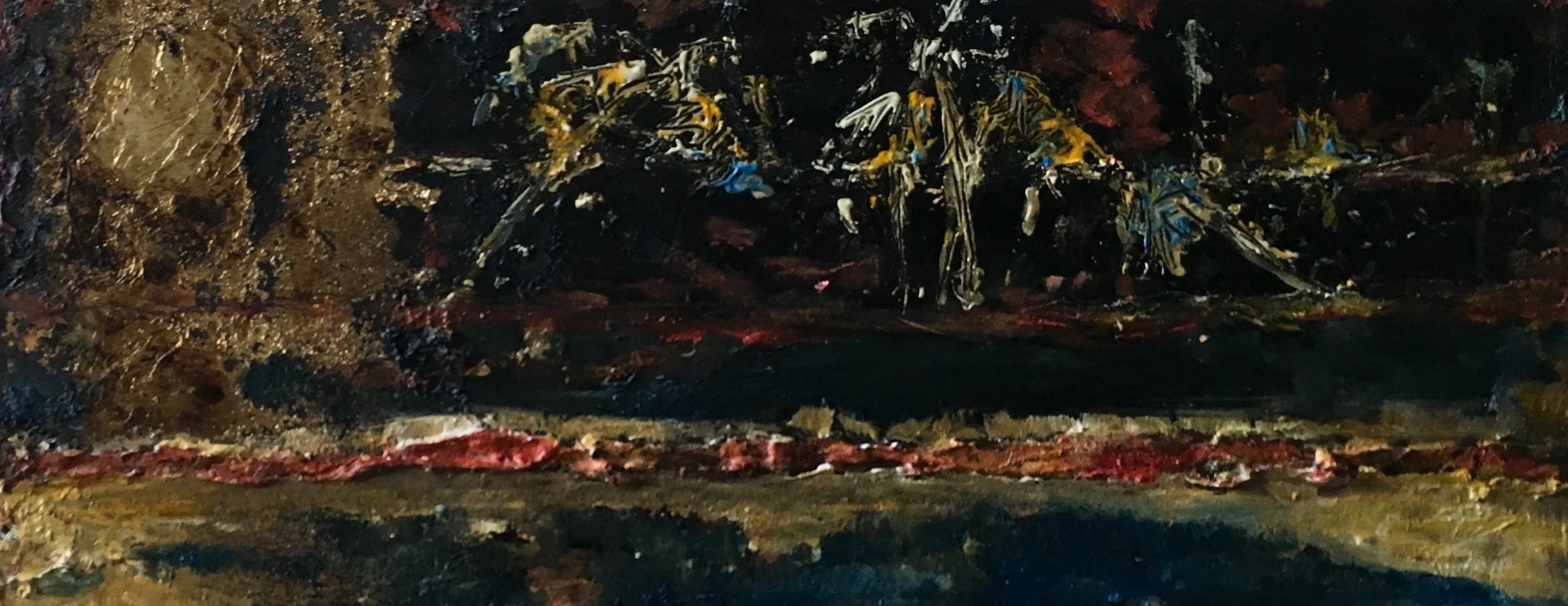
Memories of Kerala Medium: Mixed Size: 30 x 60 cm (approx.)
Lecture by Ian Monroe: All art is junk until someone calls it art
In a seminal lecture on OOO (which forms the basis of my Unit 1 essay) in November 2017 Monroe casually but iconoclastically mentioned that all art is junk until someone calls it art. Thinking of my many paintings sitting unseen in the annexe of a property that I own in Surrey I became fascinated by this idea. I began collecting things that people had thrown away with the intention of painting on them in order to elevate these pieces of junk to the level of art. I went to the laser cutting room at WCA and collected a few pieces of MDF. I scavenged the area around my flat in Camberwell and found pieces of discarded furniture. I began painting on these pieces of board. I wanted to be shaped by the ‘junk’ or rubbish and then to shape the ‘junk’. See paintings in Supporting work.. The idea is not a new one. Others have made art out of detritus. Much too has been written about the history of the found object in art.
Group Crit by Mark Fairnington Feb 21st 2018
I presented the 'Life after life' diptych at a Group crit mediated by Mark Fairnington on Feb 21st 2018.
The diptych, painted on two pieces of MDF that I found in the rubbish heap at WCA, was informed by the huge gash in the MDF which to me symbolised the lightning effect of death and in its mirror image the progression into a life after death.
Because of the questioning of the black frame in the presentation of Tenderly Together, I played around with how to present the work, whether on more junk that I had found in Camberwell or just simply as a continuous diptych to be read from left to right. There was a lot of group comment on this painting. I asked Mark for his comments. This is what I gleaned from what he said: I need to make much more of the ‘all- art- is- junk- until- someone- calls- it- art’ idea and dwell more on the moment of transubstantiation in my studio, the point at which rubbish or junk takes a new form i.e. the beginning of art. He suggested that I am onto something there, that Duchamp had done it with his coat hanger and that I need to explore this much more. He pronounced this work as ‘too resolved’.


Life after Life Media: Bitumen, gold leaf, oil paint. Size: 120 x 30 cm

Pieces of 'junk' I have collected, symbolising the Host and the early Christian symbol of the Fish.
In thinking about what Mark meant by this, I realised that prior to my painting on pieces of junk collected from the laser lab, I would sift through the junk to find pieces that might enable me to express my spirituality and philosophy of life. For example, I chose the pieces with the gash because they represented the potential for me to attempt something relating to the divide between life- death- the after life. Here are some other pieces that I chose because they stimulated in me connections to my spirituality viz. The Host and the early Christian symbol of the Fish.
As a result of the crit, I became less discriminate about what kind of junk I choose to pick up (thus far I have been picking up pieces that have the potential to express spiritual and psychological issues) and have picked up pieces in the order of their lying in the lab rubbish heap, to paint on in order to see where they lead me. This is true exploration and is different to the hypothetico-deductive mind-set that I have picked up in all m years as a social scientist. I have therefore been playing inductively with pieces of junk…

Here are some pieces I have collected ‘indiscriminately’ with the intention of allowing the junk to speak to me and shape the art. My initial idea is to play on Duchamp’s coat hanger and use a solid wooden coat hanger to create a mobile using each of these pieces. The question is what should I paint on these pieces? According to OOO artists find symbols, imbue them with meaning and create culture thereby. These pieces of junk already come imbued with some meaning. What further meaning can I paint upon them?
A Return from Art to Junk
In preparation for the studio visit by Geraint and the part time students I accidentally dropped Life after Life. It thus returned from being a piece of art to a piece of junk, a point that has philosophical value. This is its current state:

Lila 1 Media: acrylics, felt pen on MDF Size: 60 x30 cm


Tutorial with Geraint Evans Jan 2018
Another theme runs through my work. Geraint named it Damage and Repair for which I am grateful.
I have been fascinated by the Japanese art of Kintsukuroi, which is the art of mending broken pottery with gold such that the value of the mended work is greater than that of the original. As follows:

Life Abundant Medium: Pen Size: 40 x 50 cm
My own body has been broken and mended several times over the past 60 something years. I have had a brush with death through illness, I have had two cataract operations, a tonsils operation, two broken wrists and a broken ankle (due to osteopenia), two caesareans and an appendix operation.
My next work seems to be to portray these pieces of autobiography on an image or painting of myself, mended with gold and having been enriched by the process of suffering to the point of deep and lasting joy. To this end I have asked a friend to photograph my naked, middle aged body in various poses of quiet meditation and womanly empowerment.
I have used some of the images of my body in trace form in my paintings titled 'Resilience 1 &2' (See later)
Visit to My Studio March 7th 2018
I totally refurbished my studio in preparation for this visit by Geraint and other part time students. This cost me a pretty penny but was worth it! I took out all my books and gym equipment and established daylight bulbs in a tube light on the ceiling.
During this visit there was much discussion on whether the process of taking discarded bits of mdf from which figures had been cut out and used in other art pieces by other unknown artists in fact constituted plagiarism and whether I might be at the risk of being sued by the authors of the pieces I had appropriated. I argue that other artists such as Glenn Brown have appropriated art and made it their own (and that indeed working with the negative image is not actually working with the art itself but with its inverse).
Group Crit with Geraint Evans April 19th 2018
The theme of resilience and flourishing is important to me as I have researched resilience from a psychological point of view and have written a book on it. I have often found examples of resilience in nature (see below) and in aging people over 100 years old (Hutnik, 2012).
I have been interested in the life of trees and what they can do to symbolise the human condition. Oehlen’s tree paintings (See supporting work) have become famous for their organic quality. Similarly, my classmate Sirius is keen on the human faces and gestures she can see in trees. While living in Hindead I had photographed a tree that had been uprooted and had lain on its back for many years (See Supporting work). Yet it had produced a series of new trees growing directly from the fallen trunk. I was fascinated by the natural resilience of this tree. Perhaps this resonates with me because of my own history of being uprooted when I left India permanently for the UK, felt felled by the experience of immigration and then slowly with faith and tenacity put down new roots and began to grow new trees.
I presented the following work, one done on holiday in Cornwall portraying positive emotion between two people, the other done in bitumen and gold leaf overlaid with an oil paint glaze.

Tenderly Together 2 Medium: Acrylics Size: 50 x 40cm
The above painting produced minimal response. Geraint used it to point out how the layering in this painting works. After that silence from the whole group.

Resilience 1 Unfinished Medium: Bitumen, Gold Leaf, Oil Paint Size: 80 x 60 m
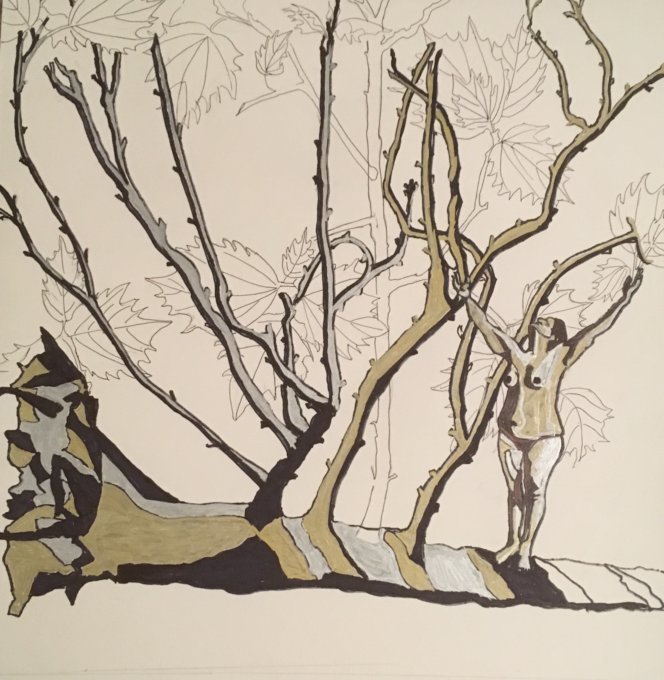
The second work too was met with distinct lack of enthusiasm. Geraint questioned its technical competence, and suggested that I consider experimenting with the orientation of the tree, with layering and with embedding small figures within the picture in much the same way as Vasundhara Tewari did in her painting. Denise suggested that I lose the sun. Sara suggested adding moss to the tree and wanted to see real bark on it in place of gold leaf. Lorraine pointed me to Annihilation a recent film that employs trees to depict emotion.
While I was discouraged, I took a number of important messages from this and made my own decisions about this painting: I do not want moss, I want buds or leaves to signify a growing living being. And I do not want to lose the sun: the whole painting is a symbolic painting of resilience and the sun has great meaning for me signifying God in life and in Nature. I thought about Geraint’s remarks about orientation, layering and embedding.
So I went back to the drawing board and started from scratch. I returned to the photographs I had taken on my walk with Sirius in Richmond Park on April 12th 2018. (See Supporting Work)
Using felt tip I produced the following two paintings:

Uprooted 1 Medium: Felt Tip Size: 29.7 x 42 cm

Uprooted 2 Medium: Felt Tip Size 42 x 42 cm
I then went back to my original tree diagram to explore layering and embedding.
Uprooted 3 Medium: Felt Tip Size: 42 x 42 cm

Uprooted 4 Medium: Felt Tip Size: 42 x 42 cm

Resilience 2 Medium: Acrylic on board Size: 66 x 56 cm
The above is the current state of the work: I used the plastic template of the resilient tree in the above to protect the white of the paper, I layered pieces of jute on the paper, painted upon it the colours of the forest. I embeded the traace of my body and using drawing inks paainteda vibrnaat new growth with leaves trungin red as if in autumn. nI then burnt the edges with a candle to represent haaving been tried by fire.
Tutorial with Geraint Evans May 3rd 2018.
Because I was unsure about where to take my work next and what to present for my Unit 1 piece I asked Geraint for an extra tutorial to help me clear my mind. He asked me one question: Looking at all the work you have been doing since last October, which type of work motivates you to get up in the morning and paint. My answer to that question was that nothing I have been concentrating on really excites me, that I have had enough of black and gold leaf, that really I am a colourist and that the three pieces that ‘float my boat’ are Mother and Her Daughters, The Ballad of David and Nimmi and Tenderly Together 2. Geraint responded by saying that perhaps this is the moment of choice. He also said that he could imagine Resilience 2 on a 7 foot canvas and suggested perhaps that I could progress two strands of work simultaneously: the resilience theme and the positive emotion theme. I pointed out that both strands use layering as part of the technique and that I could possibly use all that I have learnt to develop a new set of paintings. I therefore went back to Resilience and have worked upon it superimposing the figure of myself, a resilient middle aged woman and the line drawing a of a verdant sycamore, layering the background with jute and metallic bronze. In addition to Resilience 2, below is another piece for Unit 1.

Resilience 1. Medium: Bitumen, Gold Leaf, Oils and White Tracing Paper. Size: 80 x 60 cm
Critical reflections on other Lectures
November 8th 2017 am Painting in the Expanded Field: Geraint Evans
Geraint’s lecture encouraged us to think about what painting actually is. Does it require a canvas to be called painting? Does it require colour to be called painting? Doesn’t require form to be called painting? Does it require an artist’s active participation to be called painting? Can photographs of found objects(empty posters, noticeboard etc.) be called paintings?
At a meta- art level, does the artist need to be able to articulate the ideas that underpin his/her paintings? Or is it sufficient that the artist is conversant with the art conversations and debates that inform his or her work?
My reaction: painting is essentially a two dimensional capture of either four-dimensional realities or three-dimensional realities. To be called the painting therefore it requires a flat surface. However starting from the flat surface the artist might paint beyond it and intrude into three-dimensional space.
On the meta-art level question: I think that just as in order to be a chartered counselling psychologist one must be both a practitioner and an academic, so too, in order to be an artist one must be both practitioner and an academic. This makes for the full professional identity as an artist. The inability to articulate the ideas underpinning one’s work would show an inadequate development at the left side of the brain.
November 8th 2017 pm Collecting, classifying, and museology: Edwina
This lecture encouraged us to be systematic in collecting and researching and storing data that informs our painting. With numerous examples of classification and methods underlying classification and collection we were encouraged to consider and number of important questions related to our own practice. For example, what objects can I collect to research my topic of interest? What activities can I engaging to further my understanding of my topic of interest?
My reaction: my collections will be digital in the form photographs or emails or phone messages. I have to find a way of classifying my photographs. I also need to think about the activities that I might engage in to further my research. For example interviews.
November 5th 2017 Sunday Morning Live. BBC Live
I was inspired this morning by the resilience in artist Henry Fraser , a 17 year old rugby player who was left paralysed from neck downwards after a diving accident in Portugal. He paints with his mouth. He says, ‘Always look at what you can do and not at what you cant do…Before my accident I was physically very strong but mentally very weak.’
When asked, What makes your life meaningful? He said, “Trying to push myself”. He has become a motivational speaker and had his first ever public exhibition last summer. His website is graced with the words Accept and Adapt, Be Grateful, Everyday is a Good Day.
Nov 4th 2017 Andrew Marr: A Small Book of Painting Nov 2017. In The language of colour in Artists and Illustrators. Dec. 2017 pg 37-38
Andrew Marr talks about the language of colour with reds and oranges being warm and greens and blues being cool colours.
“Colours, even divorced from discernible shapes, make me happy and sad, energetic and depressed and this seems to be common to painters.”
He imbues colours with the following meaning:
Green: cholorophyll, grass, growth fecundity.
Dark green: shadows, dank and dismal places, even poison
Red: blood, fire, sunset and heatYellow: the sun is colour, the colour sickly skin, of diseaseWhite: call: Frost, snow, ice, nought, logic, intellect.Blues: always called, skies, sees.
And then he asks,
“Why do some colours simply seem to go well together-blue and yellow, red and green?”
He goes on to say,
“These harmonies seem to belong more to music than to vision and yet they are very powerful. Partly it’s about what sits where on the spectrum, and which primaries combine to make secondary colours. But I also think there is a simple primal sense in which the yellow of the sun and the blue of the sky has sat alongside one another forever until they are deep inside our understanding: and red earth and green growth likewise.”
Looking at his very cheerful abstract works, I got the idea that I should paint a piece of junk that I found on Doddington Grove with shapes just as Marr does.
Summary and Conclusion
The main ideas that I have absorbed duirng Unit 1 are as follows
- I hope my art will function in a therapeutic capacity to bring joy and healing to the human soul, which is more than just another object.
- In my art I will attempt to communicate simply such that it reaches the uninformed public viewer but I will also layer in depth and meaning and competent technique so that it (hopefully) speaks to the informed art world too.
- I need to carry forward my exploration of the materiality of paint such that I am totally familiar with its textures and expressive qualities.
- Going forward, I will develop my representations of the human figure in paint.